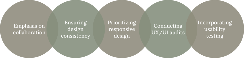
Case Study

User Experience Design Enhancement for MBBSI

Automate payroll system and simplify hiring proess
Case Study

About the client

MBBSI provides business management solutions for small and medium-sized companies. It offers professional employer services, assuming responsibility for payroll, payroll taxes, workers’ compensation coverage, and certain other administration functions for the client’s existing workforce. MBBSI also provides staffing and recruiting services.

What were they looking for?​

MBBSI aimed to automate the payroll process and enhance user experience to reduce physical involvement while creating payroll. Simplify the hiring process and make the application easy to navigate and mobile-friendly.

  • Create an automated payroll system to reduce interactions between MBBSI employees and client
  • Make the hiring process simple and easy
  • Easy navigation structure
  • Users are used to with the existing application and should not get confused with the new app
  • Mobile-friendly app

Who were the target users?

The application was built for multiple user types:
  1. Headquarter Users
  2. Branch Users
  3. Client Users Admin
  4. Client Employees

Team Size

The project lasted for more than two year and six months and involved a team of approximately 70 members, including three UX designers.

My role in the project

  • Manage Design System
  • Collaborate with the stakeholders (Client, BA team, UX team, and developers to discuss the business requirements and users goals and needs)
  • Present UX design to stakeholders
  • Ensure consistency in design
  • Take part in sprint planning sessions and retrospectives
Case Study

Problem Statement

The client used an expensive third-party app for payroll and onboarding and wanted to cut costs by developing their own. Their current app required manual payroll intervention, was prone to errors, lacked mobile responsiveness, and had cluttered navigation. They were concerned about the usability of the new app, ensuring it wouldn’t add unnecessary complexity for users familiar with the existing system.

Pain Points

Below are some key pain points

Pain Points

Design process

Knowing that our project would be developed in an Agile setting, we recognized the need for designers to be highly responsive. This entailed conducting user research to pinpoint the precise challenges users were encountering and addressing them through usability testing. Consequently, we established the following procedures:

Process
  1. Emphasis on collaboration: In an Agile environment, seamless collaboration is paramount. Any communication gaps could potentially result in incorrect or subpar UX design deliverables, impacting the entire team, especially the developers who rely on these designs for coding.

  2. Ensuring design consistency: Crafting a Style Guide or Design System proved instrumental in maintaining design uniformity. This resource not only aided UX designers but also supported the development team in creating consistently patterned UI elements.

  3. Prioritizing responsive design: Given the client’s requirement for mobile/tablet responsiveness, we prioritized designing for various screen sizes as a pivotal aspect of our process.

  4. Conducting UX/UI audits: After a page’s development phase, the QA team conducted testing, while our UX team conducted a UX/UI Audit. This step ensured that the pages were aligned with the UX designer’s vision. In Agile settings, time constraints often make it challenging to consistently create pixel-perfect mockups. Effective collaboration with developers was crucial in articulating our design requirements.

  5. Incorporating usability testing: To refine our design, we sought feedback from end users through usability testing, ensuring that the final product met their needs effectively.

Challenges and solutions

1. Improve Navigation Structure:

We created a mega menu and a self customisable favourite navigation bar to make the navigation super easy for novice as well as expert users.

How we did that:
  1. User research and analysis: Conducted user interviews and surveys to understand user behaviors, pain points, and needs related to navigation.
  2. Content audit: Conducted a comprehensive content audit to assess the existing menu items, categories, and content structure.
  3. Information architecture: Developed a new information architecture, reorganizing menu items based on user priorities and task flows.
  4. Navigation labels and terminology: Used clear and concise labels for menu items, ensuring they accurately represented the content they led to.
  5. Mega menu: Came up with a Mega menu design to organize and display sub-categories or related content in a visually organized manner
  6. Responsive design: Ensured that the navigation worked seamlessly on different screen sizes, including desktops, tablets, and mobile devices.
  7. Collaboration with developers: Worked closely with developers to ensure the new navigation was implemented correctly and functioned as intended.
  8. Usability testing and feedback: Conducted usability testing with real users to evaluate the effectiveness of the new navigation.
  9. Feedback: Gathered feedback on whether users could easily locate and access desired content.
Navigation

2. Automated payroll system

  1. Research and Requirements Gathering: Conduct in-depth interviews and workshops with stakeholders, including HR personnel, accountants, and employees, to understand their needs and pain points related to payroll processing.
  2. Scenarios:
    1. The current system is complicated and confusing to use especially for new users
      1. We simplified the application by breaking down the task into several steps
        1. Select batch of employees
        2. Enter hours and earnings
        3. Calculate
        4. Verify the calculation
        5. Process the payment
    2. There is no provision to import the timesheet
      1. We provided an option to import Time sheet
    3. There are a lot of manual interventions where the clients would call MBBSI branch users to make the correction before processing the payroll.
      1. We provided the feature to verify the payroll before the payment process
      2. Dark pattern. We did not highlight the feature to contact MBBSI branch so that it is tough to contact the branch


3. Design System

After conducting interviews with both users and stakeholders, we identified the following areas of concern:

Pain points:

The outcome​

Here are some notable outcomes of this project

Increase in user satisfaction

  • Post-implementation surveys indicated a 20% increase in overall user satisfaction compared to the pre-redesign phase.
  • User feedback scores on key satisfaction metrics improved from an average of 6.5 to 8.9 out of 10.

Increase in adoption or engagement​

  • The adoption rate of the redesigned feature saw a notable spike, with a 30% increase in new user sign-ups within the first month after launch.
  • Daily active users (DAU) saw a 25% boost, indicating a significant improvement in user engagement levels.
  • Conversion rates for the checkout process improved by 15%.
  • The bounce rate for the landing page reduced by 12%, signifying a more engaging and effective user experience.

Learning

We gained valuable insights from this project

Usability testing​

Due to budget constraints, formal usability testing was limited. We conducted in-house testing for certain modules. A broader in-house testing across the entire application could have yielded more user feedback, enhancing the overall user experience.

Mobile first design approach​

While adopting a mobile first approach for customer modules, time constraints prevented us from fully refining higher resolution designs for all application pages. This resulted in leaving some aspects of the design to developers. There was room for improvement in enhancing the design for higher screen resolutions on certain pages.

Prime NG​

Limited familiarity with Prime NG UI design posed some challenges, leading to occasional rework due to compatibility issues with the desired design.

Component library and design system​

While the component library played a crucial role in maintaining consistency and expediting the design process, we fell short in establishing a comprehensive design system for developers. This led to additional work for developers in order to uphold design consistency throughout the project.

Case Study

Designing Intuitive Platform for QCells to Monitor Solar Panels

Case Study

Re-designing Enterprise Application for MNXL Logistics

Website design and content © 2024 Salim Ansari