Case Study
Designing Intuitive Platform for QCells to Monitor Solar Panels
How did we design the user experience that everyone loved

About the client
Qcells is a prominent solar energy company that specializes in the manufacturing and development of solar photovoltaic (PV) products..
What were they looking for?
They sought our help to develop a web application for their clients, aiming to provide an intuitive platform for monitoring solar panels, a seamless process for purchasing and installation, and an efficient fleet management program for themselves.
Who were the target users?
- Anyone who wants to buy and install solar panel and monitor the device
- Qcells staff who will monitor the fleet

Users Insight
- Most of the customers will purchase the solar power as a long-term investment that will ultimately lead to reduced energy bills
- Most of the customers are motivated by the idea of generating their own clean energy
- The customers are concerned about the upfront costs of solar panel installation
- They don’t have extensive technical knowledge about solar systems
- They are worried about how solar panels might affect the aesthetic appeal of their home
- Almost 70 – 80% of the customer will use their cell phones to access the web app
Team Size
The team involved 7 members from our company and 6 members from the client side. It was a 4 months project
My role in the project
- I lead the UX design effort, producing all major deliverables and presenting these to the client
- I worked alongside a junior UX designer.
- I was responsible for research, interaction design, visual design, and usability testing.
- I worked with the front-end developers and a business analyst.
How did the project get started
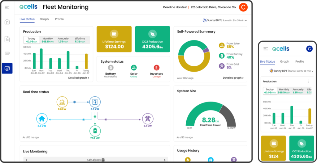
Initiating the Customer Dashboard Project
The initiative began with designing and developing the customer dashboard to manage the solar panel system and monitor buyers.
The client shared an initial outline of desired components, which we reviewed to understand their requirements. We then conducted further research and held a call with the client to clarify specifics, addressing all queries.
Our goal was to go beyond the client’s instructions and create a more user-friendly solution, prompting us to conduct additional research before starting the design phase.
Pain Points
Below are some key pain points
Existing system is time consuming
Qcells attracts users through its website and encourages registration, followed by manual communication. Currently, purchasing and installation are also handled manually, making the process time-consuming and error-prone.
Complex questionnaire
The company uses an in-house application to ask targeted questions and provide tailored solutions to customers. However, due to the excessive number of questions and poor formatting, customers often skip responses.
Complex structure of the application
The process of purchasing and installing solar panel systems involved complex stages for company advisors, requiring specific actions at each step. The current application was not user-friendly, often causing confusion for users.
Process & planning
Each project possesses its unique characteristics, necessitating tailored processes and planning approaches. In the case of this particular project, its relatively compact scale and time constraints limited the scope for extensive usability testing. Additionally, recognizing that a majority of users accessing the customer module do so via mobile devices, we strategically focused on mobile optimization in our planning process. With these considerations in mind, we devised a specialized plan and approach for this project.
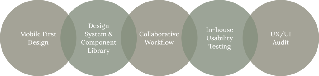
Mobile first design approach
Recognizing that nearly 70-80% of users would predominantly utilize mobile devices to access the application, we prioritized a mobile-first design approach for the customer modules. The admin modules, however, were tailored exclusively for desktop use.
Efficient Design System and Component Library
Swift design delivery was imperative to prevent delays for developers. To expedite this process while ensuring design consistency, we harnessed the power of the Sketch Component Library. Its seamless implementation greatly aided us in maintaining uniformity across the application. Notably, during an unforeseen color scheme alteration, the use of Color Variables facilitated swift adjustments.
Collaborative workflow
Daily synchronization calls were instituted, fostering seamless communication within the internal team and with the client. To assess the technical viability of designs, we actively engaged developers, thereby preemptively addressing any potential feasibility challenges. Given the project’s reliance on NG Prime, which presented certain constraints, involving developers and the QA team in brainstorming sessions proved instrumental.
In-house usability testing
In instances where budget constraints limited formal usability testing, we conducted in-house assessments with team members from diverse departments. This process ensured that critical user experience evaluations were still integrated into our development approach.
Comprehensive UX/UI audit
Drawing from prior experiences, we recognized the potential disparities between proposed designs and actualized pages. To bridge this divide, a rigorous auditing process was implemented, ensuring seamless alignment between design concepts and final implementation.
Challenges and solution
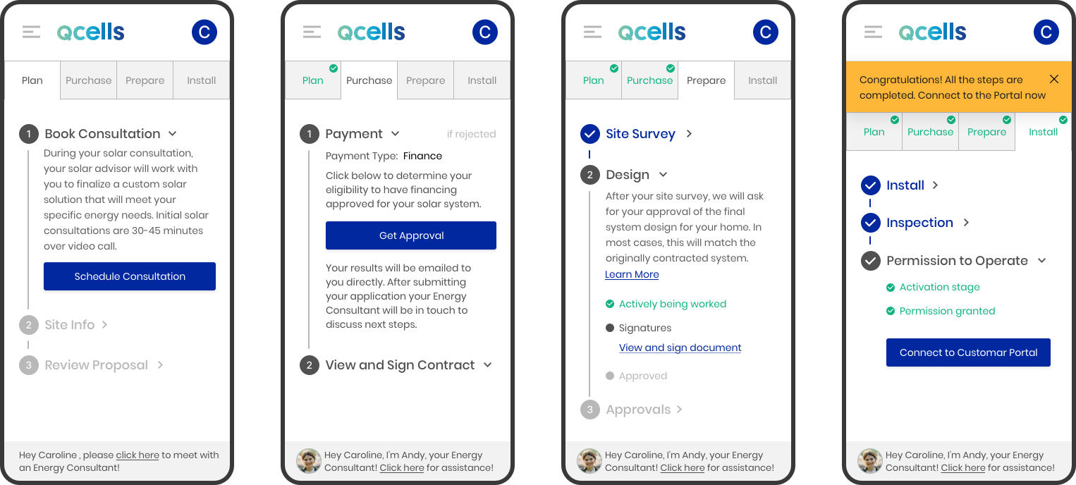
1. Confusing App design
The entire process within the Buy and Install module proved to be confusing for users, as they encountered difficulty in discerning their current progress and the subsequent actions required. Clarity was often lacking regarding when specific actions should be executed.
Solution
- We undertook a restructuring effort, segmenting the Buy and Install module into four primary steps and further breaking them down into sub-steps.
- Some stages were automated in nature; for instance, users received notifications concerning scheduled consultations, and upon successful consultation, an installation document was dispatched.
- On the other hand, certain stages demanded user participation, such as reviewing and accepting documents or uploading photos.
- We formalized the necessary steps based on client input and presented them with checkmarks denoting completed steps and highlighting the current step.
- This approach aimed to enhance user comprehension.
- To facilitate user engagement, we implemented a notification system that would appear at the page’s upper section. This feature effectively conveyed to users when specific actions were required.
- We employed two distinct notification styles: one for actions necessitating user input and another for general system notifications or user feedback.
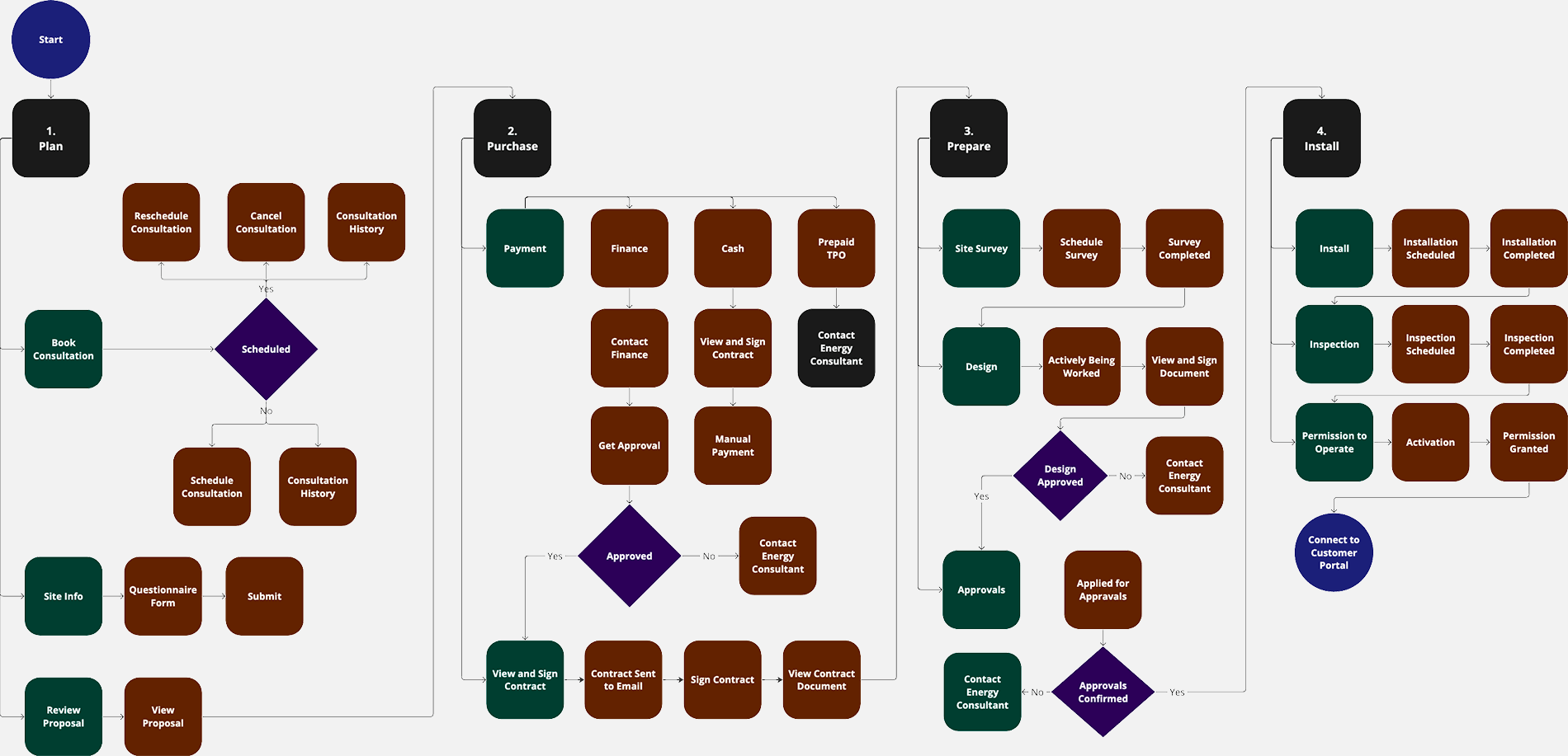
2. Vague requirement
Initially, the specifications for the Buy and Install module were unclear. This was due to the presence of numerous steps, where users were required to take certain actions in some, while in others, the system would prompt them to proceed once the preceding step’s task was completed in the background.
Solution
- In order to grasp the sequence of steps and necessary actions for customers to purchase the solar panel system, we organized our comprehension into a spreadsheet.
- Subsequently, we engaged in a clarification process with the client, involving iterative discussions.
- Despite some initial back-and-forth, we successfully attained a thorough comprehension prior.
- Then we worked on the User Flow before commencing the wireframe and prototype design phase.
3. Nested table
During our collaboration on the “Program Management” module, we devised a data table design that featured an embedded nested table. This design choice was motivated by the need to visually represent the relationship between programs and their corresponding child sites. Initially, this design approach appeared elegant and facilitated a clear association between programs and sites. However, upon further reflection, we recognized a potential drawback: as the grid’s column count increased, it could introduce design intricacies. Specifically, the presence of numerous columns could complicate scrolling and the alignment of columns with their respective headers.
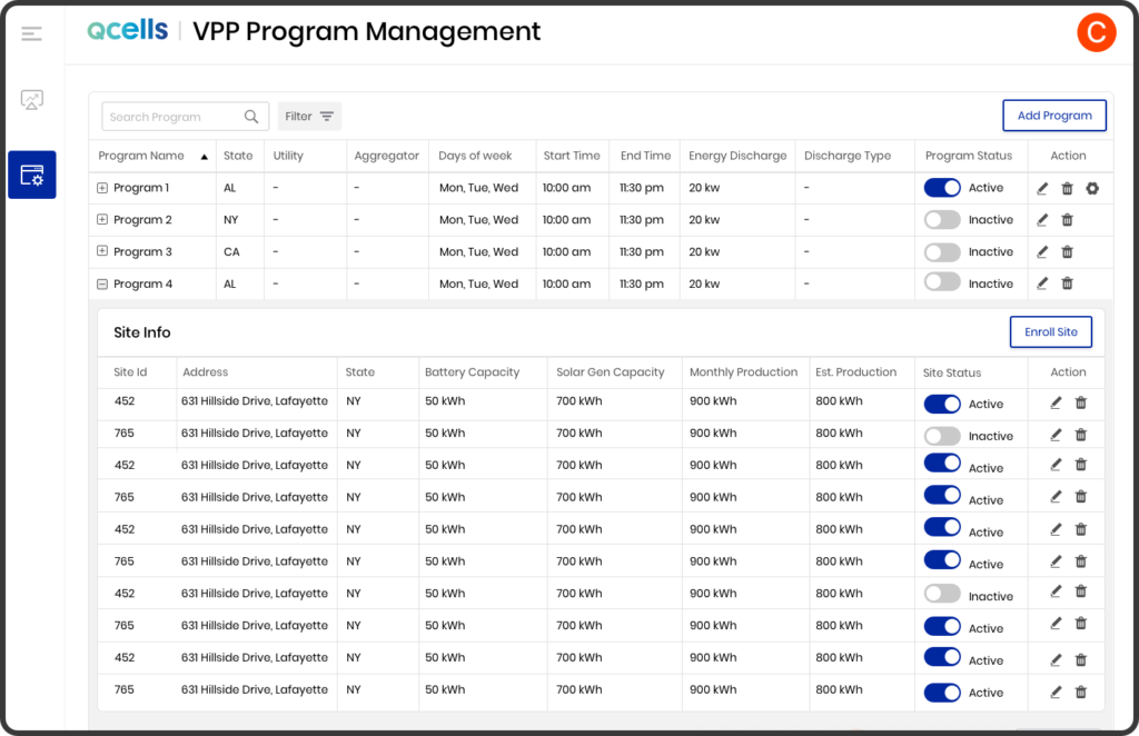
Solution
- We moved the child table (Site information) to a new page called Program Details page
- To add or review Sites under a program, users should click on the program details icon in the action column.
- This page allows users to execute various actions, including editing/deleting a Program and adding/removing Sites from it.
- The updated design offers a more intuitive user interface, reducing any potential confusion for users.
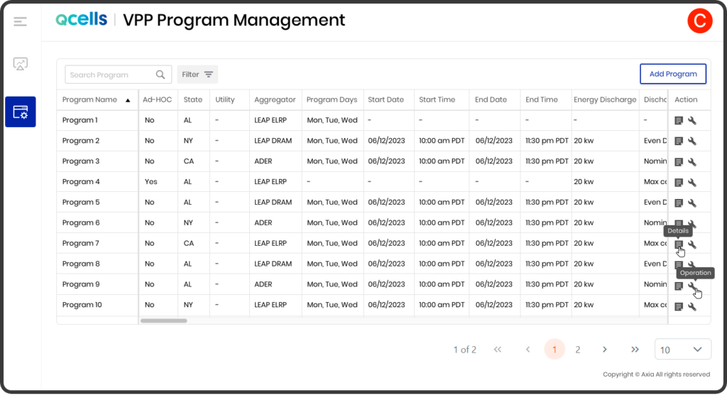
4. Data table actions
In the beginning, we incorporated Edit and Delete actions within the data grid to provide users with a convenient way to modify or remove their desired programs. However, upon receiving insights from the customer, we realized the potential ramifications of program deletion and the need for admin users to have visibility into program details before proceeding with deletion.
Solution
we made the decision to relocate these actions to the Program details page to ensure more informed and cautious decision-making.
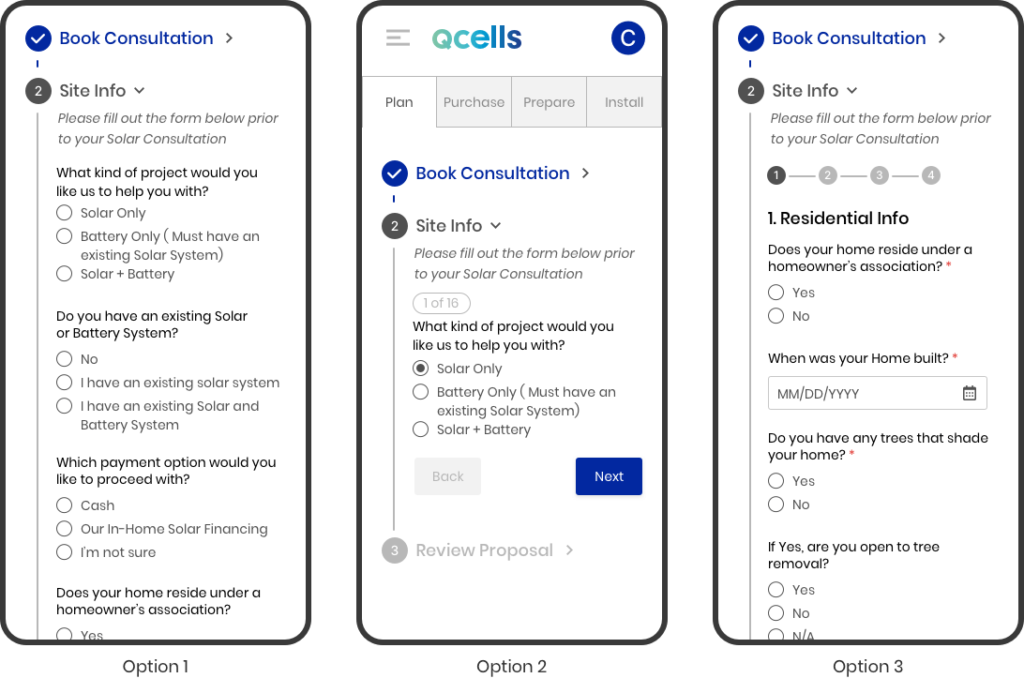
5. Complex questionnaire
Within the solar panel Buy and Installation module, a dedicated section was designated for customer use. This section included a comprehensive questionnaire, which encompassed a multitude of queries. Our team devoted efforts to devising numerous strategies aimed at simplifying and enhancing the user experience, striving to create an engaging and user-friendly environment that would encourage users to readily complete the form.
Solution
- We proposed two options for the questionnaire.
- Option 1: A single-page form with all the questions on one page.
- Option 2: Displaying one question at a time.
- We then conducted usability testing in-house, and here are the outcomes:
- Option 1: A single-page form with all the questions on one page
- Pros:
- Users found the long form easy to complete as they didn’t need to click the next button multiple times.
- Cons:
- The page was lengthy, which might deter some users from filling out the form.
- Pros:
- Option 2: Displaying one question at a time
- Pros:
- Presenting one question at a time made it easier for users to comprehend and respond. It reduced cognitive load.
- Questions were easy to locate.
- Clear indication of the total number of questions and progress.
- Cons:
- For desktop or higher resolutions, a long form might be a more convenient option for filling out the form.
- Pros:
- Option 1: A single-page form with all the questions on one page
- Based on the usability testing results, we decided to take a middle approach. We restructured the form into four steps, each containing three to four questions. This solution proved to be more effective than the initial two options.
6. Absence of usability testing budget:
The client lacked the financial resources for formal usability testing
Solution
- we opted to conduct internal testing using team members from various departments not directly involved in the project.
- This approach yielded invaluable insights that significantly enhanced the user experience.
- The knowledge gained greatly influenced the design of key components, including the Questionnaire module, Fleet Management module, Customer Dashboard page, and Program Management module.
7. Adding sites to program
Initially we designed the sites adding functionality with the following steps:
- Go to Program Details
- Click on Add Site button
- From the Add Site model window search the site(s) you want to add
- Select the site(s) from the search result and then hit the Add button
- The site(s) get added to the program
However, upon presenting the design proposal to the client, we were advised that the addition of sites should be approached cautiously due to associated costs.
Solution
- As per their requirements, the inclusion of a site in a program necessitates the admin user’s action of clicking a final “Save” button to confirm the site’s inclusion.
- Drawing from insights gained through past projects, we anticipated that users might overlook this critical step, presuming that sites were automatically saved once added to the program. To address this, we implemented the following measures:
- After successfully adding the sites to the program, users were alerted that the program’s changes were pending and that they must click the save button to confirm the modifications.
- In the event that users inadvertently navigate away from the page, an additional notification serves as a reminder to save the newly added sites under the program before proceeding.
The outcome
Here are some notable outcomes of this project
Increase in user satisfaction
- Post-implementation surveys indicated a 20% increase in overall user satisfaction compared to the pre-redesign phase.
- User feedback scores on key satisfaction metrics improved from an average of 6.5 to 8.9 out of 10.
Increase in adoption or engagement
- The adoption rate of the redesigned feature saw a notable spike, with a 30% increase in new user sign-ups within the first month after launch.
- Daily active users (DAU) saw a 25% boost, indicating a significant improvement in user engagement levels.
- Conversion rates for the checkout process improved by 15%.
- The bounce rate for the landing page reduced by 12%, signifying a more engaging and effective user experience.
Learning
We gained valuable insights from this project
Usability testing
Due to budget constraints, formal usability testing was limited. We conducted in-house testing for certain modules. A broader in-house testing across the entire application could have yielded more user feedback, enhancing the overall user experience.
Mobile first design approach
While adopting a mobile first approach for customer modules, time constraints prevented us from fully refining higher resolution designs for all application pages. This resulted in leaving some aspects of the design to developers. There was room for improvement in enhancing the design for higher screen resolutions on certain pages.
Prime NG
Limited familiarity with Prime NG UI design posed some challenges, leading to occasional rework due to compatibility issues with the desired design.
Component library and design system
While the component library played a crucial role in maintaining consistency and expediting the design process, we fell short in establishing a comprehensive design system for developers. This led to additional work for developers in order to uphold design consistency throughout the project.