Case Study

Re-designing Enterprise Application for MNXL Logistics

Enhanced the app’s usability while working in an Agile team

Project overview

About MNXL

The application was developed for a company that provides logistic services worldwide. Their Clients include multinational leaders in the biopharmaceutical, life sciences, high-tech, medical device, aviation, entertainment, and financial industries. These organizations rely on the precision logistics of MNXL to safely and securely deliver high-value, time-critical shipments around the world.

What was their objective?

MNXL aimed to revamp their Enterprise Application to enhance the efficiency of their logistics services. They had separate applications for local and international operations, and their goal was to integrate all features into one unified application. Additionally, they tasked us with addressing usability issues within the application.

Users and audience

The application was built for multiple user types:
  1. Agents who take/create orders from customers
  2. Managers/supervisors, who track the orders, assign drivers and make sure the delivery is on-time.
  3. Store Managers, who manage the warehouse and handle material.
  4. Website Admins, who manage the portal, onboard employees, and customize the portal

Team size

The project lasted one year and three months and involved a team of approximately 100 members, including seven UX designers.

Logistic service case study

My role in the project

  • Lead a UX team of 6 members
  • Facilitate Design Thinking Workshop
  • Supervise and administer Design System
  • Collaborate with the stakeholders (Client, BA team, UX team, and developers to discuss the business requirements and users goals and needs
  • Present UX design to stakeholders
  • Ensure consistency in design
  • Take part in sprint planning sessions and retrospectives

How was the project started

Every project requires a tailored design process. To establish this process, it was vital to ascertain the level of UX design the client desired. Additionally, I sought to gain insights into their business operations, user demographics, and identify user pain points, among other crucial details.

I participated in the initial call with one of the Subject Matter Experts (SMEs) from the client’s team, which was scheduled for an hour. In the first 45 minutes, he elaborated on their operations and how users initiate orders and manage tasks. This initial conversation provided me with a comprehensive understanding of the application.

Subsequently, in the remaining 15 minutes, I inquired about the users’ objectives and the challenges they encountered. The SME shared a compiled list of user pain points, which proved invaluable as a starting point for our work on the application.

Pain points

Initial painpoints

Design process

Recognizing that the project would be undertaken using Agile methodology and was slated to be a substantial endeavor, requiring approximately a year for design and development, we instituted a set of Guiding principles and established the UX design process.

Guiding principles

Guiding Principles

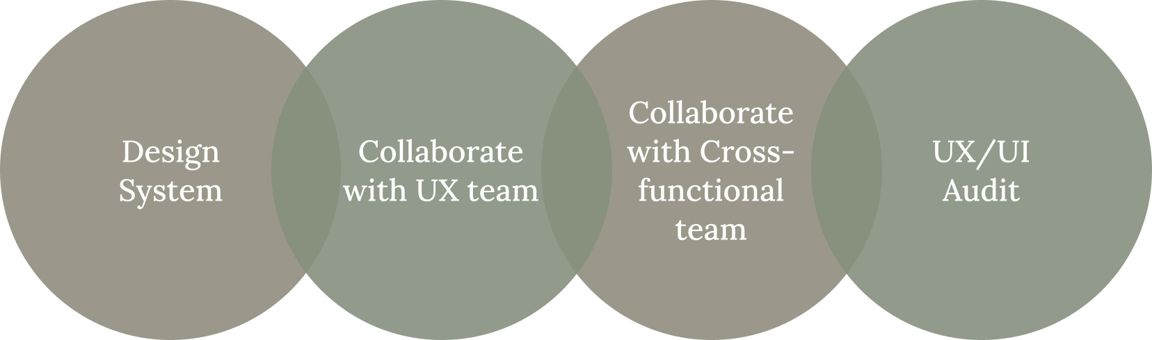
We established four guiding principles for the projects within our Agile team: Design System, Collaboration with UX team, Collaboration with cross-functional team, and UX/UI Audit.
  1. Designing a design system:
    Due to the enormity of the project, it was advisable to have a Design System in place to ensure consistency in design. Our Design System included UI Patterns, Style Guide, and guidelines for Design and Development. Before embarking on any UX/UI Development, we created standard page layouts containing navigation, headers, and form elements while simultaneously developing the Design System. The Design System was continually updated with new components and guidelines to address evolving UX/UI requirements.
  2. Collaboration with the UX team:
    I had a daily sync-up meeting with the UX team to check everyone’s work and make sure everyone is following the Design System. If there are new elements introduced by any of the designers we needed to add that to the Design System
  3. Collaboration with cross-functional team:
    We had regular calls/meetings with the cross-functional team. The key to success in an Agile environment is collaboration. We made sure that everyone is on the same page.
  4. UX/UI audit:
    At the end of every sprint, the UX team would check the UI is aligned with the UX that is provided by the UX team and we would submit a report. If there are any gaps or misalignments, the UI team would fix the issues

UX design process

  1. Requirement gathering and user research:
    We had a regular call with the product owner (client side) where I and Business Analysts were part of the call. We used to discuss the new business needs and users’ goals.
  2. Point of View and How Might We statement:
    Once we had the business goals and users’ needs, we would sit together with UX and Business Analyst team and work on the Point of View Statement and How Might We Statement to solve the user’s pain points
  3. Brainstorming:
    During our Brainstorming sessions we used to find answers for our How Might We statements. We would include UX and BA teams and also ask developers/engineers to join the Brainstorming sessions. We encouraged everyone to come up with their own ideas and finally select the best idea by the Dot Voting method. The presence of developers/engineers would make sure the solution is feasible.
  4. Wireframe/Prototype:
    The UX team would work on the wireframe/prototype design as per the Brainstorming session output
  5. Design review and usability testing:
    We would review the wireframe/prototype with the BA and Engineering team and then present the design to the client/users
  6. Feedback and iteration:
    After the Usability testing and feedback from the client, the UX team would work on the design iteration.
  7. Design handover to developers:
    Present the overall designs to the Sprint team before the start of the sprint. Sometimes we get good feedback from the Sprint team and would work on the design changes.
  8. UX/UI audit:
    Upon the conclusion of each sprint, the UX team would review the interface to ensure it aligns with the UX design provided by the UX team and submit a report. In the event of any gaps or misalignments, the UI team would be responsible for addressing and resolving these issues.

How we came up with the proposed solution?

The application had numerous features, but for this case study, I will be focusing on the key feature we concentrated on. The client’s priority was to enhance the order creation feature, which was crucial for their business.

Web Application Screen

Order creation (key feature)

What is order creation?

Order creation involves receiving and processing pickup and delivery orders from customers. When a customer places an order over the phone, agents (users) take down the order details and simultaneously create an order/quote within the app.

User/stakeholder interview

After conducting interviews with both users and stakeholders, we identified the following areas of concern:

Pain points:

The legacy system had a complex form with tons of fields for creating an Order.

The form fields and the fonts were so small that people with low vision will have trouble

The Order Creation page contained an increasing number of buttons, including Order, Will Call, Quote, and Decline
Users are required to spend a considerable amount of time filling out the form, including repetitive information

The Order Summary section was not visible and users always needed to scroll to the bottom of the page to see the Summary.

The agents sometimes needed instruction from customers and they had to read the instruction before proceeding with the order creation.

Point of View (POV) statement

Every user is required to generate over 100 orders daily. They seek an interface that is uncomplicated, easy to grasp, and expedites order creation compared to the current application. Additionally, they aim to execute order processing tasks efficiently, ensuring no tasks are overlooked and transactions occur without delays. Moreover, there are two different applications (used by two different sets of users) that need to be combined in a very efficient way so that both user groups are happy with the new application.

"How Might We" (HMW) Questions

How might we streamline the order creation process to enable users to effortlessly generate more than 100 orders a day?

· • —– ٠ ✤ ٠ —– • ·

How might we merge the functionalities of the two separate applications in a way that satisfies both sets of users seamlessly?

Brainstorming

With the help of the POV Statement and HMW Questions, we gathered enough information to commence our Brainstorming Session. Our team consisted of a diverse group of individuals, including product owners, business analysts, UX designers, and developers, which allowed us to generate a wide range of ideas. We then narrowed down the ideas and proceeded to the wireframing and prototyping phase.

Solutions:

  1. Hiding unwanted features:
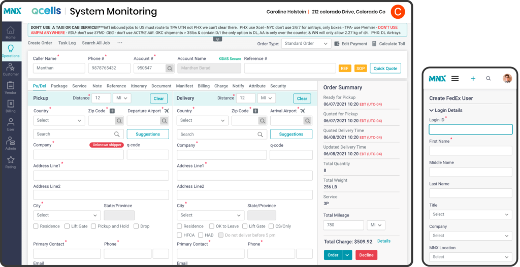
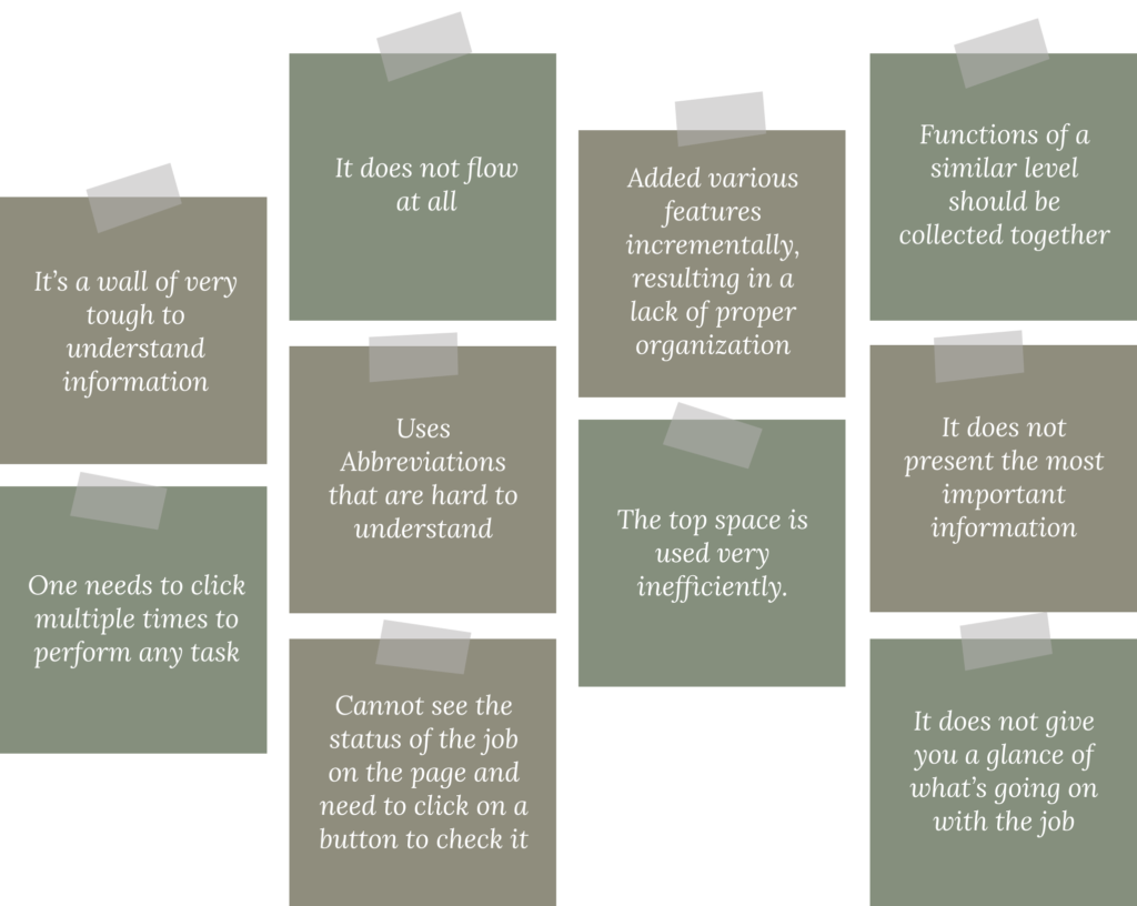
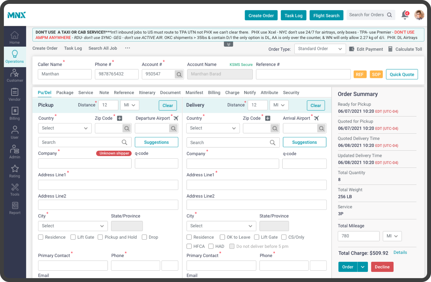
    While the form encompassed numerous fields, not all were strictly mandatory for completion. Additionally, we identified certain fields that had remained untouched by users for an extended period. To address this, we conducted an affinity diagram exercise, grouping the fields into 11 distinct categories. These categories were then organized into corresponding tabs. The initial tab, labeled “Pickup/Delivery,” featured the most frequently used fields, crucial for order creation. As a result, nearly 80% of the time, users would find all necessary fields within this primary tab, obviating the need to navigate to other sections during the order creation process.Affinity diagram
  2. Accessible in all devices:
    While the form encompassed numerous fields, not all were strictly essential for completion. Additionally, we identified certain fields that had remained untouched by users for an extended period. To address this, we conducted an affinity diagram exercise, grouping the fields into 11 distinct categories. These categories were then organized into corresponding tabs. The initial tab, labeled “Pickup/Delivery,” featured the most frequently used fields, crucial for order creation. As a result, nearly 80% of the time, users would find all necessary fields within this primary tab, obviating the need to navigate to other sections during the order creation process.
  3. Minimized call to actions for faster decision-making:
    An abundance of choices can lead to confusion and hinder the order-creation process. Thus, we conducted research to identify the four buttons most frequently utilized by users, as well as those that were seldom used. Consequently, we streamlined the interface to feature a single switch button with “Order” as the default, complemented by “Will Call” and “Quote” as dropdown alternatives. The remaining button was designated as “Decline”. Essentially, this setup ensured that only the “Order” and “Decline” buttons were prominently displayed.
  4. Easy reusability:
    We proposed implementing a feature that would store the “Pickup” and “Delivery” addresses for each customer. This way, when users input the customer ID in the future, the system would automatically present the previously used addresses as suggestions.
  5. Easy to use and understand layout:
    We positioned the Order Summary section on the right side of the screen, ensuring it remained fixed and visible without requiring users to scroll to the bottom of the page. This design choice allowed for convenient and continuous access to the Order Summary. Additionally, crucial information such as “Ready for pickup,” “Quoted for pickup,” “Quoted Delivery Time,” package details, pricing, and more were distinctly separated, facilitating easy readability for users
  6. Easy pickup/delivery instructions:
    We provided the instructions at the top of the page where users can see two lines of instruction initially. If there is more text, they could expand/collapse the box to read the complete instructions and fill out the form accordingly.
Result
  1. The new application was designed with both user groups in mind, and both were able to adapt to the new design without any issues.
  2. By adopting a minimalist design approach, we were able to increase the speed of the order creation process by 50%.
  3. The floating Order Summary section greatly simplified the process of updating customers on their order summary.

Project Challenges and Solution

  1. Maintaining consistency in design:
    In UX design, maintaining consistency is vital because it allows users to perform tasks more efficiently and leads to a positive user experience. However, consistency can be difficult to maintain in large projects and teams, such as this one. To ensure consistency, we implemented the following measures.

    a. Design system:
    Our Design System comprised a UI patterns library, style guide, and design guidelines, which the UX team adhered to as a guiding principle. This approach ensured a consistent UX design across the product.

    b. Component library:
    To maintain consistency throughout the application design and save time, we developed a Reusable Component Library in Sketch containing all the UI patterns and typography styles. This allowed us to use the same components repeatedly throughout the application without the need to design them from scratch.

    c. What’s new:
    During the daily sync-up call of the UX/UI team, there was a designated section called “What’s New” where all the designers would share any updates related to the UX/UI design that they had worked on. These new design patterns were subsequently incorporated into our design system, and the UX team members were notified of the changes.

    d. UX/UI alignment audit:
    The UX team initiated the UX/UI Alignment Audit at the outset of the project, enabling them to identify and communicate UI issues or findings to the UI/Angular team early on. This proactive approach led to a better-looking UI and saved us valuable time.

  1. Working in Agile Environment:
    We worked in an Agile environment where we had limited time to obtain user feedback, iterate on designs, and obtain approvals before delivering the files to the development team. We took the following measures:

    a. Designing for the smallest possible thing:
    Design smaller, viable, and useful features and improvements

    b. Slicing designs:
    Taking one aspect of a feature and shipping it to get feedback before building the entire feature

    c. Refactoring designs:

    Changing the structure of a design to meet new goals
    Design Refactoring

    Refactored navigation structure from top to left
    d. Collaborative mindset:
    To ensure a collaborative mindset and shared goals and ultimately deliver a better product that meets user needs, we urged UX designers to work closely with the development team and engineers rather than working in isolation or silos, thus eliminating any communication gap.

  1. Co-ordination with tech leads and architects:
    Although we had good coordination with Teach Leads and Architects, sometimes we could not involve them in our brainstorming sessions and could not review our designs before sending them to the client. This sometimes resulted in a design that is not technically feasible.

Learnings

  1. Proper iteration of UX design was not done:
    The Agile environment presented challenges, and we often had limited time to conduct comprehensive usability testing to improve the UX design after completing a story. The strict project deadline also meant that we had to rush to design for upcoming sprints to keep the engineers occupied.
  2. Design refactoring was not done:
    In an Agile environment, we often work on completing features in stages, which allows us to receive regular user feedback and adjust our design approach accordingly. However, as we progressed, we sometimes discovered that the current design did not meet the needs of our users. In such instances, we needed to restructure the design, but time constraints often prevented us from doing so.
  3. Could not involving tech leads in all brainstorm sessions:
    We could not involve Tech leads or Architects in all brainstorming sessions and also could not review all our designs with them. This sometimes resulted in re-designing as some of the designs were not feasible technically.
  4. Design system (partially implemented):
    Thorough planning is crucial before beginning a large project, as rushing at the outset may lead to issues later on. While the Design System proved effective for the UX Design team, the UI team did not have sufficient time to create a UI pattern library within the system. As a result, inconsistent UI designs emerged, necessitating additional rework. We could have a dedicated developers team for creating and maintaining the Design System and the initiative should have been taken from the beginning of the project.

Website design and content © 2024 Salim Ansari